昨天翻 GitHub 找到一个 Material Design 的主题,因为是 MD 所以看着很心动,于是赶紧装上试了一下(
经过半天的调整,总算是符合我的审美要求了,这里就记录一下整个主题更换过程吧(
ToC
黑幕
注:现在以及用上 KAAAsS 的黑幕插件了(
换了个主题首先要加上的是黑幕。但因为主题的影响,原来的 css 不能直接用,因此作了一些改动:
/* heimu */.heimu,.heimu a,a .heimu { display: inline; background-color: #252525; color: #252525 !important; text-shadow: none;}
.heimu:hover,.heimu:active { transition: color 0.13s linear; color: #fff !important;}
.heimu:hover a { transition: color 0.13s linear; color: #add8e6 !important;}这里和之前最大的区别就是加上了 !important,否则这个样式的优先级比主题的要低,会被主题的字体颜色顶掉(
字号
默认的字号普遍比我期望的大了一圈,遂改小之(
/* size */#mdx-toc a { font-size: 14px;}
.mdui-list-item { min-height: 40px;}
.mdui-list-item:after { height: 40px;}
.ct1-p { font-size: 16px;}
h1 { font-size: 1.5em;}对齐
我个人是希望图片对齐是永远居中的,所以直接加 CSS 了(
/* align */figcaption { text-align: center;}
img { margin-left: auto; margin-right: auto;}
黑夜模式
第一眼看到这个黑色就感觉太黑了,于是调亮了一点(
/* Dark mode */.mdui-theme-layout-dark .mdui-appbar > [class*="mdui-color-"]:not(.mdui-color-transparent) { background-color: hsl(0, 0%, 14%) !important;}
.mdui-theme-layout-dark .ArtMain0 { background-color: hsl(0, 0%, 20%);}
.mdui-theme-layout-dark div.PostTitleFillBack2[class*="mdui-color-"],.mdui-theme-layout-dark div.PostTitleFill[class*="mdui-color-"],.mdui-theme-layout-dark div.PostTitle[class*="mdui-color-"] { background-color: hsl(0, 0%, 14%) !important;}
.mdui-theme-layout-dark .spanout { background-color: hsl(0, 0%, 18%) !important;}
.mdui-theme-layout-dark .timeInPost { background: linear-gradient( to right, rgba(41, 41, 41, 0) 0%, hsl(0, 0%, 16%) 5%, hsl(0, 0%, 18%) 100% );}
.mdui-theme-layout-dark .page-footer-nav.mdui-color-theme.mdx-post-nav-clean,.mdui-theme-layout-dark .page-footer-nav.mdui-color-theme.mdx-post-nav-clean * { background-color: hsl(0, 0%, 14%) !important;}
.mdui-theme-layout-dark .foot { background-color: hsl(0, 0%, 14%);}以及这里用了 HSL,原样式用的是 #RRGGBB。
adminbar 遮挡
左侧的抽屉会被 #wpadminbar 挡住。这个 adminbar 还是有点用的,想要一键改文章的时候很方便,得想办法适配(
/* wp-adminbar */body.customize-support .mdx-side-title { padding-top: 2pc;}
body.customize-support .nightVision { top: calc(10px + 2pc);}
@media screen and (max-width: 782px) { body.customize-support .mdx-side-title, body.customize-support .mdui-toolbar { margin-top: calc(-2pc + 46px); }
body.customize-support .nightVision { top: calc(10px + 46px); }}
抽屉宽度
宽屏模式下的抽屉也太窄了,于是加宽了一点(
/* sidebar */@media (min-width: 1024px) { .mdui-drawer { width: 320px !important; }
.mdui-drawer-close { -webkit-transform: translateX(-320px); transform: translateX(-320px); }
.mdui-drawer { width: 320px !important; }
.mdui-drawer-close.mdui-drawer-right { -webkit-transform: translateX(320px); transform: translateX(320px); }}主页图片
说是主页图片,其实改的是图片上面显示的字的相关内容。不透明的边框确实不大行,直接把后面的图片遮住了,观感很差。于是加了点透明度,看起来就好多了。
/* index-image */@media screen and (min-width: 750px) and (orientation: landscape) { body.mdx-first-tworows .mdx-tworows-title > div { background-color: #fffb; }
body.mdx-first-tworows.mdui-theme-layout-dark .mdx-tworows-title > div { background-color: hsla(0, 0%, 19%, 0.3); }}
对于移动端而言,图片是单独显示的,不会有文字在上面悬浮,所以就不改了(
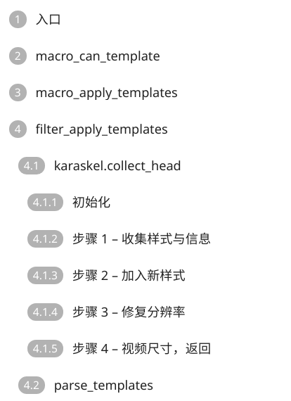
目录
目录是整个过程中最大的麻烦了。默认的目录只能显示到 h3,这对于这篇文章显然是不够的(笑)
所以首先是要让目录支持到 h6,于是我修改了 toc.js:
function getTitleListHtml(maxLevel = 6) { let titleList = $( [...Array(maxLevel).keys()].map(l => `article > h${l + 1}`).join(",") ); if (titleList.length <= 1) { isToc = false; return false; }
let finalHtml = ""; let finalPreview = "";
let counter = 0; let titles = [...Array(maxLevel)].map(l => 0); for (title of titleList) { title.dataset.mdxtoc = "mdx-toc-" + counter; titleArr.push("mdx-toc-" + counter);
const level = Number($(title)[0].tagName[1]); titles[level - 1]++; titles.forEach((_, i) => i >= level ? (titles[i] = 0) : titles[i] === 0 && (titles[i] = 1) ); finalHtml += `${titles.filter((_, i) => i > 0 && i < level).join(".")}${$(title).text()}`; finalPreview += ``; counter++; } return [finalHtml + "", finalPreview];}这个修改将目录等级支持增加到了任意级,并且省略了 h1。省略 h1 是我个人需求,因为我文章中不可能出现 h1(事实上也不应该出现,h1 本来的语义就是一篇文章只有一个,代表全文的标题)。对应的没有省略 h1 的代码已经丢到原仓库的 [issue](https://github.com/yrccondor/mdx/issues/113) 了(
之后,我们就要规定左侧的 padding 了,这里方便起见每级 +10了(
/* toc */.mdx-toc-item-h2 { padding-left: 10px;}
.mdx-toc-item-h3 { padding-left: 20px;}
.mdx-toc-item-h4 { padding-left: 30px;}
.mdx-toc-item-h5 { padding-left: 40px;}
.mdx-toc-item-h6 { padding-left: 50px;}最后效果是这样的: